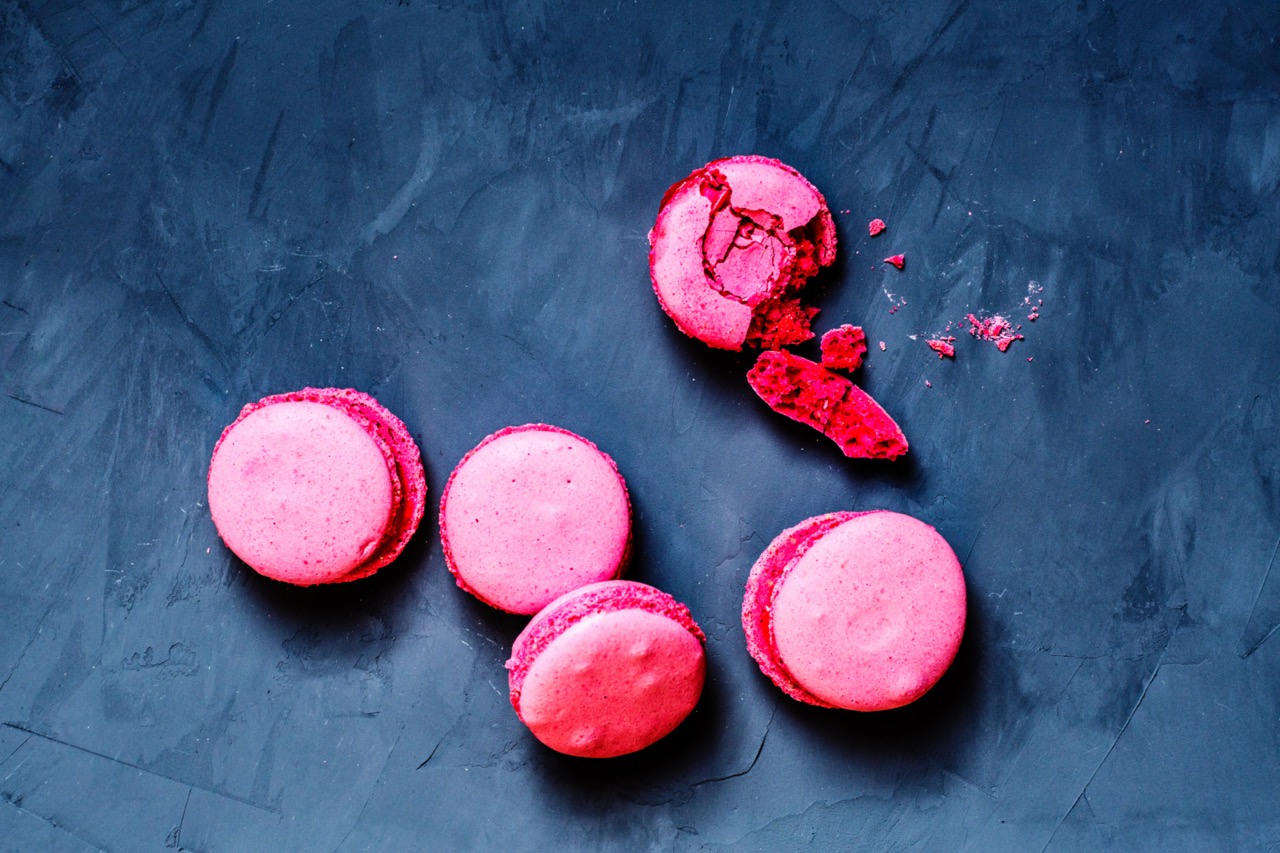
Precision creates bright pink
Get in touch to request samples, discuss custom formulations, or obtain volume pricing for your supply chain.
talk to a color expertUnlike red, orange, yellow, blue, or purple, pink is not produced by a dedicated pigment family of its own. It is almost always adiluted version of a red pigment, whether that pigment is betanin, an anthocyanin, or another red source covered earlier in this series. That distinction matters because it means the pink formulation is really a use-rate problem layered on top of every stability challenge already covered for red,which makes precision far more important than source selection alone.
Products built around pink, from strawberry beverages to bubblegum-flavored candy to watermelon-flavored anything, were shaped for decades by synthetic dyes capable of producing a clean, bright pink at very low use rates. Natural sources can absolutely reach that same vibrancy. Still, they demand more careful handling to avoid the muddy, dusty rose tone that givesnatural pink a reputation for looking washed out compared to its synthetic predecessor.
Betanin, covered in depth in our original red color comparison, delivers a genuinely bright pink when used at a lower concentration than what would be needed for a full red. Its heat- and light-sensitivity,already a limitation at full strength, becomes even more noticeable at the lower use rates typical of pink formulations, so process conditions deserve extra attention.
Anthocyanins at a strongly acidic pH sit at the red end oftheir color range, and appropriate dilution can produce a clean, stable pink. This is one of the more forgiving natural pink strategies, since acidic conditions are exactly where anthocyanins are most stable to begin with, a dynamic covered in more depth later in this series.
Red radish extract, built on naturally acylated anthocyanins, has emerged as a dedicated pink specialist rather than ageneral-purpose red source. Its acylation gives it stronger heat and light stability than many other anthocyanin sources, and its natural hue leans toward pink and magenta even before dilution, making it a strong starting point for a formulation targeting pink specifically rather than red.
Carmine, covered in our original red comparison, remains one of the most stable natural pink options when appropriately diluted, thanks to its strong tolerance for heat, light, and pH variation. As with any carmine use, its animal-derived origin rules it out for vegan, vegetarian, and many Halal- or Kosher-positioned products, regardless of its performance advantages.
Because pink depends on hitting a specific dilution rather than a saturated full-strength color, small dosing errors are far more visible than they would be in a deeply colored red or purple product. Precise, well-calibrated dosing equipment and tight batch-to-batch consistency checks matter more here than almost anywhere else in this series.
Base ingredients with their own color, even a faint one, can shift a carefully dosed pink toward brown or gray far more easily than they would shift a deeply saturated red. Reviewing the full ingredient list for any component with even mild inherent color is worth doing before finalizing a pink formulation, not after a batch already looks off.
A bright white or very pale base gives a diluted pigment the best chance to read as a clean, vibrant pink rather than competing with an underlying tint. This mirrors the base color guidance covered in our icings and fillings post, and it applies just as directly to a beverage or confection base as it does to a butter cream.

© 2026 Vivify food & beverage | All Rights Reserved | SITEMAP | ACCESSIBILITY statement | TERMS